ABI INTERIORS’ LONDON SHOWROOM LAUNCH
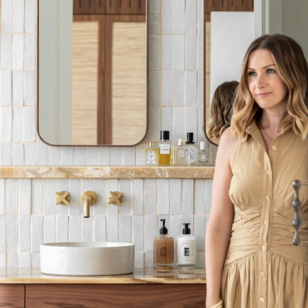
Written by interior designer Diane Martin, founder of Atelier Racine.
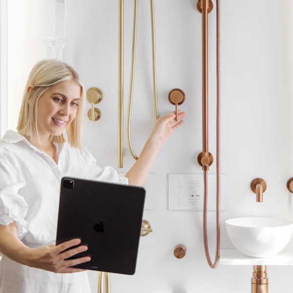
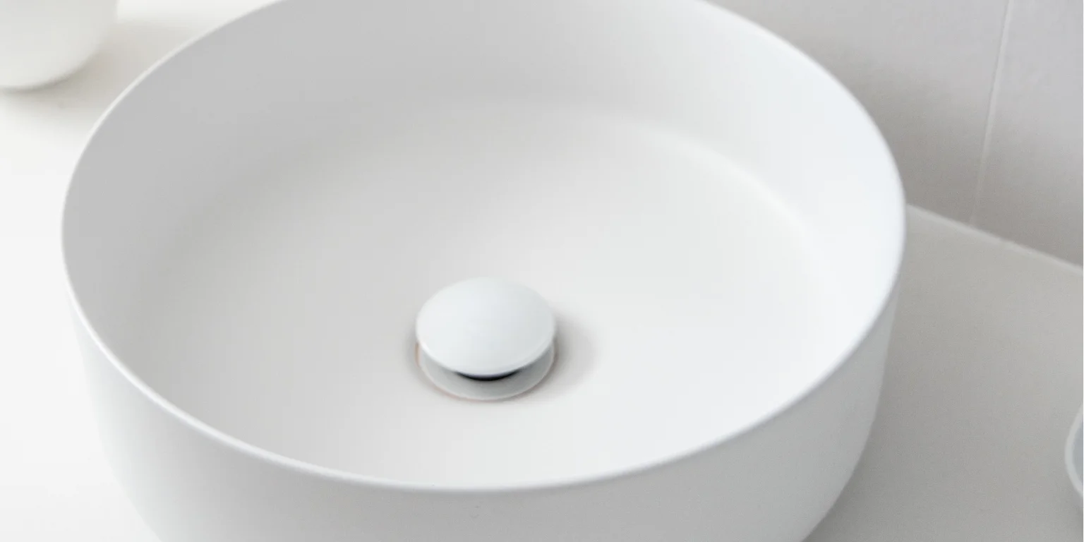
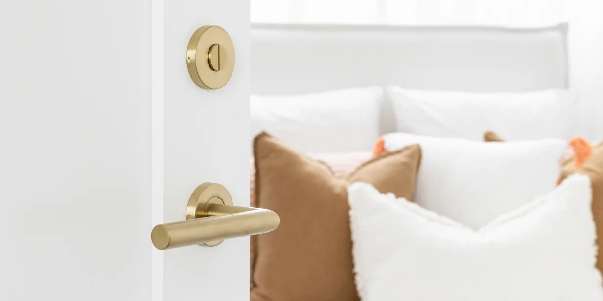
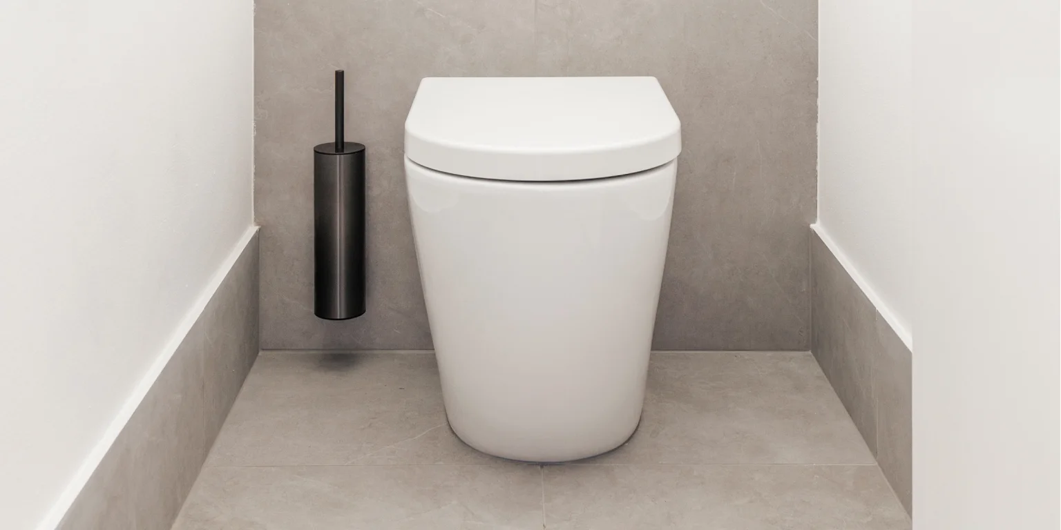
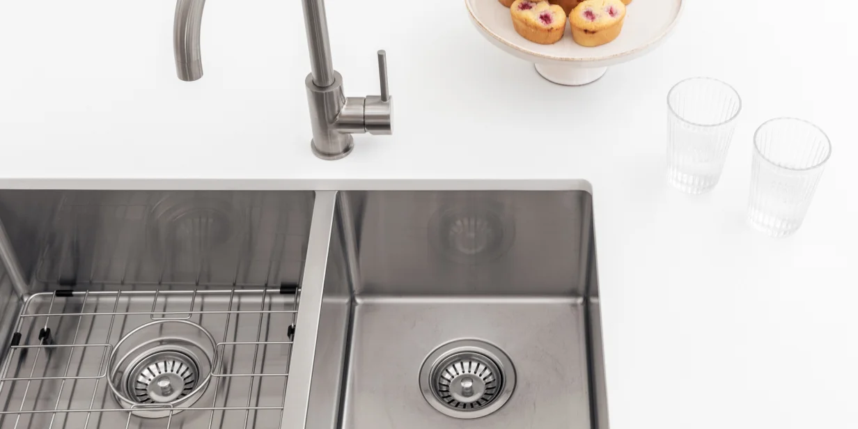
In early September, ABI Interiors opened a new showroom at the renowned Design Centre, Chelsea Harbour in London. This represents a significant milestone as the first ABI showroom in the United Kingdom and the third worldwide. The showroom will provide a platform to exhibit ABI’s world-class technology, creativity, and architecturally designed products.
I worked closely with ABI’s design team to create a sophisticated space that references the brand’s Australian origins.
ENCOURAGING ENGAGEMENT
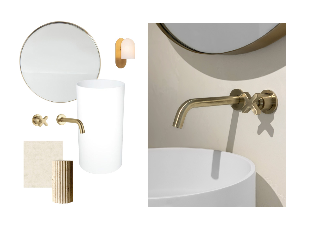
It was a marble-fluted vase designed by En Gold that had such beautiful texture and depth of material, which inspired the design language of the showroom.
To me, it really encompassed ABI’s brand aesthetic and their vision for the London showroom. Shared as a reference point while developing the brief with them, it had an easy elegance, a perfect mix of the natural Australian design approach and London’s timeless, urban aesthetic.
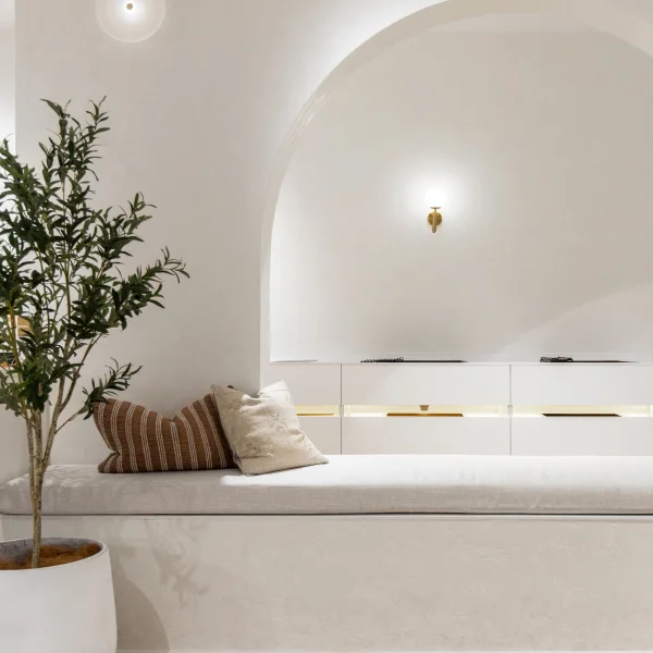
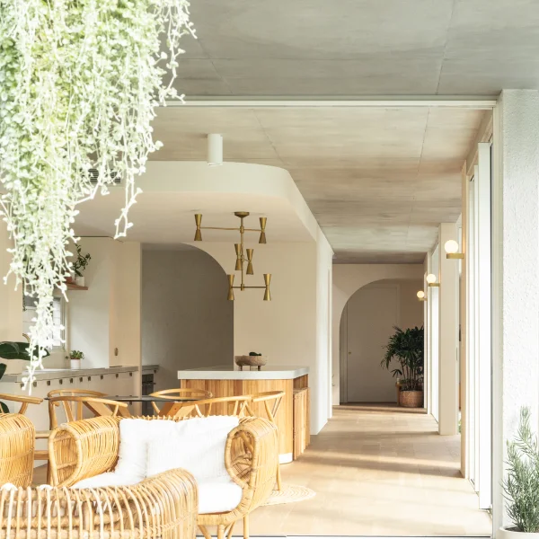
The showroom was designed to be a tactile environment where customers can engage with the products, and it made sense to encourage this with a subtle play of textures. ABI’s products take centre stage while the space and various materials slowly reveal themselves to you.
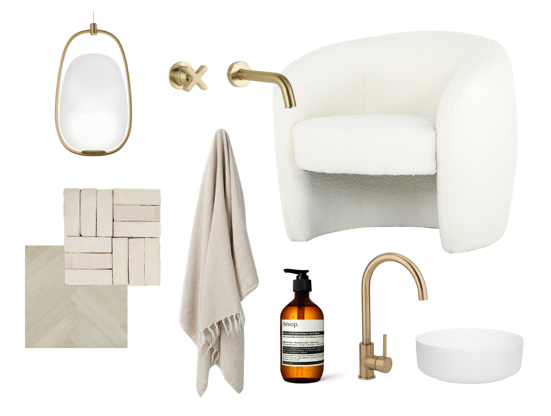
We kept a very simple, natural monochrome palette to create a bright and welcoming interior. We chose materials that would be familiar to clients, such as tiles, stone, plaster, etc. But we tried to use them creatively and put a unique twist on their application.
A DYNAMIC SPACE
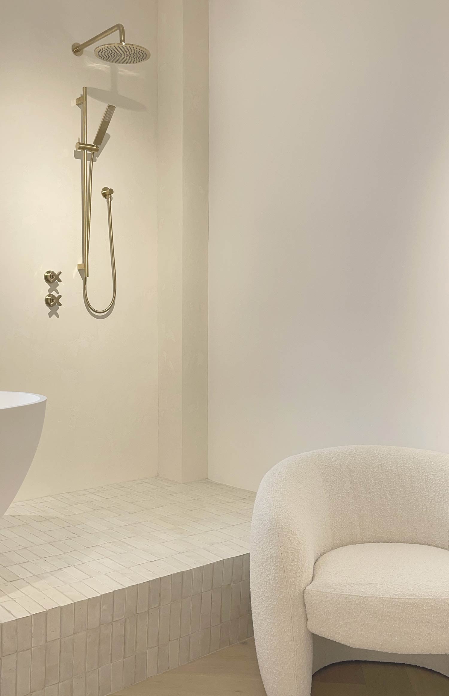
I see the space as a dynamic environment. One aspect is a more passive, instinctive experience for the visitor: the music, a perfumed scent, the various visual elements. But it also has a part that proactively makes you want to engage with the products and the space itself. I love interiors that make me feel a certain way without pinpointing the source of those feelings too easily. It is this elusive and intangible dynamic which I am fascinated with, as it questions how we interact with our surroundings and how they impact us on all levels of consciousness.
FEATURES AND MATERIALS OF THE SHOWROOM
CRÉMA VERANA MARBLE BENCHTOP
Taking centre stage in the space, this bespoke piece was designed to be a desk and a display bench for products. Therefore, our choice of material for this feature element had to be versatile, showstopping, and highly durable. We wanted a familiar yet luxurious material that could be found in various applications around the home, especially in rooms where ABI products would be used, mainly the bathroom and kitchen. The Créma Verana marble chosen for this piece ticked all the boxes. It has a warm, natural colour and a velvety appearance. We decided to specify it in a honed, matte finish to keep a modern approach in line with the brand’s aesthetic and because it looked good enough to eat.
BAMBOO MOSAIC TILES AND BEJMAT FLOOR TILE
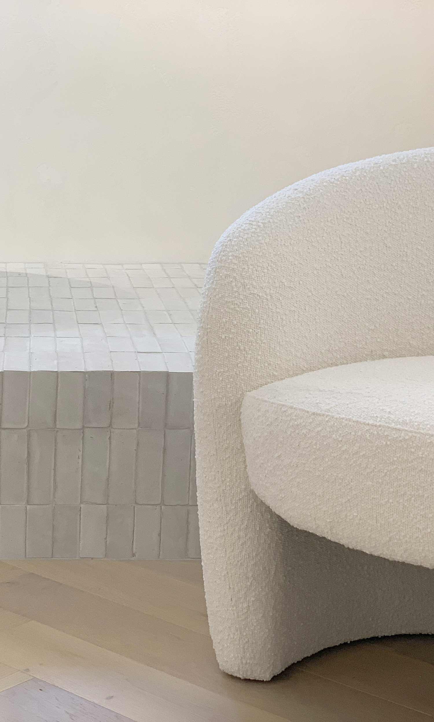
Another prominent design feature was the raised platform at the back of the showroom, showcasing an inspirational bathroom setting. It needed to be an attractive focal point as it faces the customers directly as they enter the showroom. We wanted to be authentic in our material choice while also consciously deciding to stay away from a prosaic bathroom look by introducing a global design vernacular.
The Bejmat tile is a traditional, hand-crafted item that is truly a labour of love, with each piece unique in shape, colour, and size. It encompassed the ABI approach to provide products that highlight the individual beauty of each space.
The mosaic chosen for the bath mixer plinth follows the same principle. The format was ideal, as it allowed an easy practical function, contrasting enough with the platform tiles, yet keeping a similar feel. The scale balances well with the Bejmat tiles and adds a playful and contemporary feel.
BESPOKE VENETIAN PLASTER
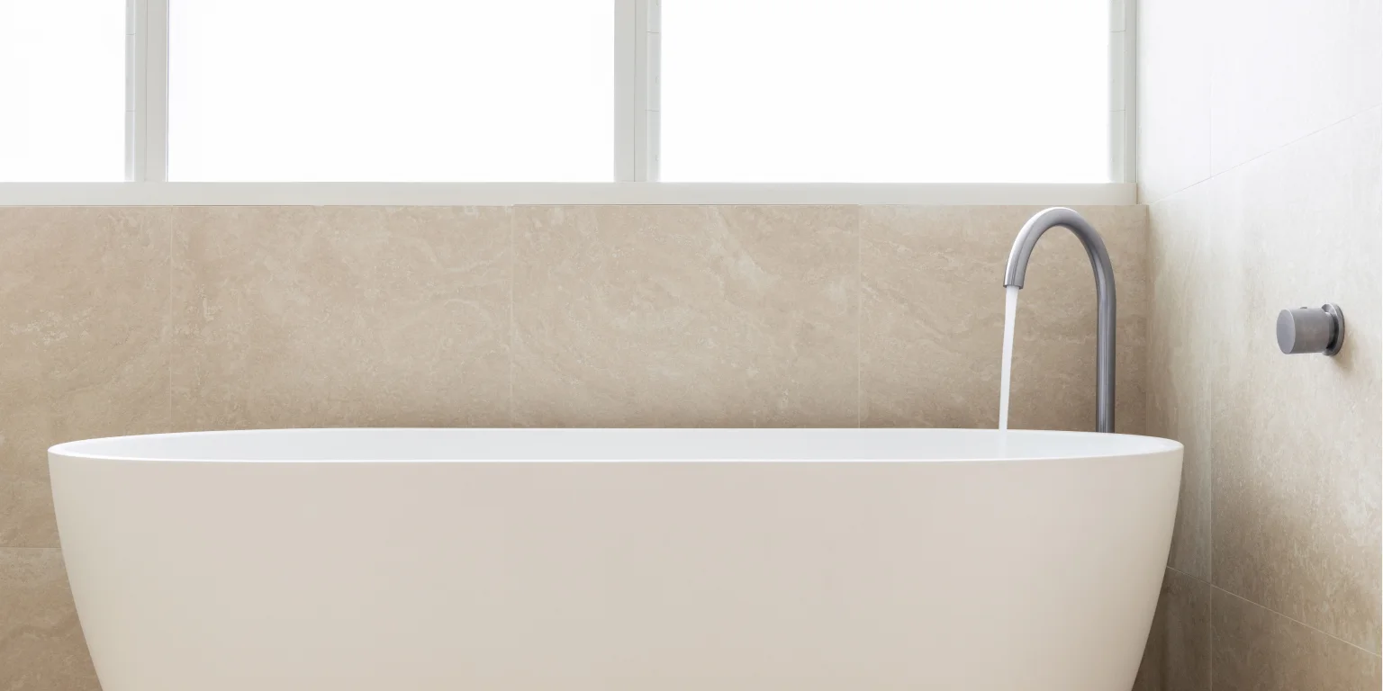
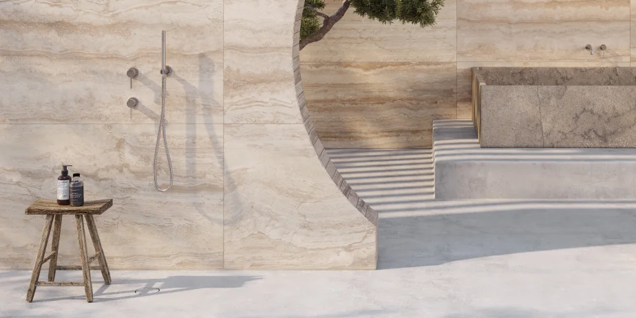
Within this open space, we needed to create distinctive yet cohesive environments. We wanted the back of the showroom, with its raised platform and the window display, to feel like individual settings. They were both designed to feature a bathroom set-up or showcase a particular product. Staying true to our honest approach, we decided to use Venetian plaster. With the play of the lighting, the surface seems to be ever-changing, as the customer walks through the space. The contrasting textures and subtle natural tones offer the perfect backdrop to the crisp, white solid-surface bath, and basin. This material is also a natural, traditional material that ties in with the Bejmat tiles, both in application and intrigue, reflecting a global design influence.
ABOUT THE DESIGNER
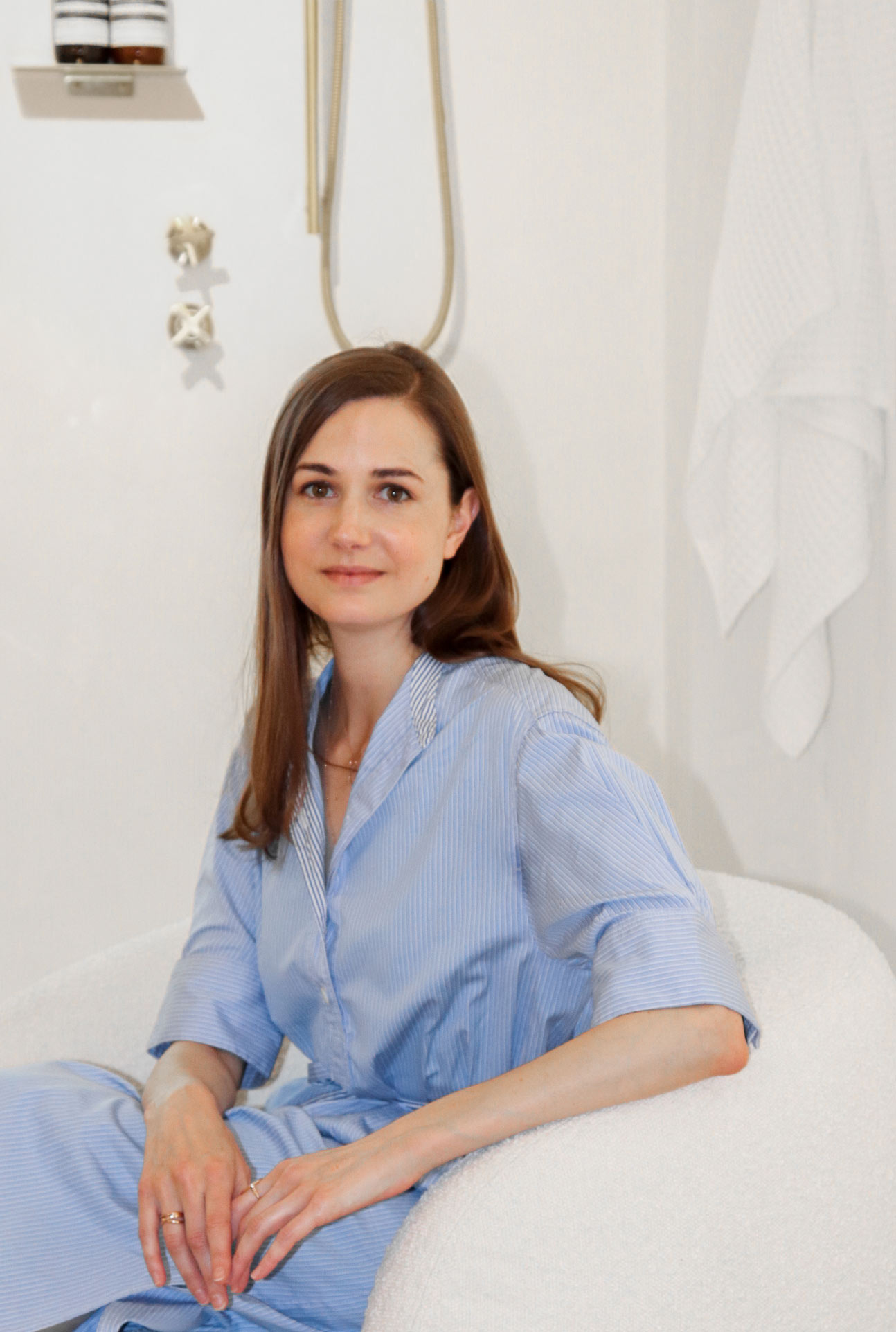
I founded my interior and architectural studio, Atelier Racine, after years of experience working for high-end design practices across London.
I believe nothing is insignificant, and all experiences possess valuable elements which can later be an unexpected source of inspiration. This led me to a rich, unconventional career path, working in all aspects of the design and construction industry. I was fascinated by every facet of design and the numerous articulations involved.
I’m less interested in trends but rather use elements that align with the context of the project, enrich the design, or give it depth. There is a wealth of talented, forward-thinking designers, and I believe we should perpetually learn from each other to enrich our design vocabulary. This is why I created Atelier Racine, which to me is a venture promoting a collaborative path, offering a rich experience, both for the client and the project team. It cannot be a selfish endeavour but rather a way to bring people together to create a thoughtful and sustainable design, with all layers considered holistically.
Diane Martin —
Instagram: @atelierracine
Website: www.atelier-racine.co.uk
To visit and experience this inspirational space for yourself, please view our location page here.
